
Tristan Lalor
Note: Data has been altered and all company-sensitive information has been obscured to respect the privacy of internal company data.
Here is a look at what we will be creating. This is a data visualization of 14 period moving averages of units sold, by state, with daily granularity. It is broken up by category for the X segment of the business. The top left choropleth is X sales overall, the top right is the A segment, bottom left is B, and bottom right is C.
This visualization is valuable to observe what kind of differences there are geographically among these difference segments, as well as what changes are occurring throughout the year. This is one clue to answering the question: how can we best specialize marketing for certain X products geographically and seasonally?
The first step in building this visualization is obtaining a data mart from Adobe Analytics (or any other data one might wish to use; however, the program outlined below is built for processing data dumps from the Adobe Data Warehouse). Notice the data’s original output format. There are NULL fields above each group of states, which need to be accounted for. This will be one of the first things we do once we start normalizing the table.

The first thing we want to do is open up our integrated development environment for working with Python (I use PyCharm), and import 2 classic data science packages that we will be using right off the bat: Numpy and Pandas.
The first obejctive of the code is to make the imports and define a function to return CSV data files as a numpy array.
import pandas as pd
import numpy as np
def readcsv(filename):
data = pd.read_csv(filename)
return(np.array(data))
Python
Next, we will load in our data dump from Adobe Analytics and remove all rows for which there is no associated state. This will also remove all aggregate rows that Adobe gives us.
#Obtain the report
Comp_Array = readcsv(Report)
# cut out all null values
Comp_Array = Comp_Array[~pd.isnull(Comp_Array).any(axis=1)]
# take out all commas
for i in range(0, np.size(Comp_Array,0)):
Comp_Array[i,0] = Comp_Array[i,0].replace(",","")
Python
The next task is to generate a list of dates to be used to collect daily data for each date in the list we will generate. This snippet of code will generate a list of every date for the time period of our data dump; there are also extra dates, but we will cut those out later.
day_lst = range(1,32)
month_lst = ['January', 'February', 'March', 'April', 'May', 'June', 'July',
'August', 'September', 'October', 'November', 'December']
year_lst = (2018, 2019)
dates_lst = []
for year in year_lst:
for month in month_lst:
for day in day_lst:
date = str(month)+" "+str(day)+" "+str(year)
dates_lst.append(date)
Python
Notice how in the image below, each state is colored inside the gradient and outlined in white.
For this to be the case, we need to have plottable values for each state in this choropleth, and unfortunately they cannot be null or zero in order for them to show up consistent with the color scale. To accomodate this limitation, we will go through and add values to each day for all of the states that are not included in the data, and add the value .00001 in place of their actual revenue of 0. The logic behind this code is to obtain the difference between the active state codes for a given day, and the inactive (null) state codes for a given day – that is to say the states which we did not do business. With this difference size, we can generate a new array filled with plottable values, and then stack them together to create a full array with each state included, for each day of the year.
files = []
all_codes = readcsv("0codes.csv")
for date in dates_lst:
indices = np.where((Comp_Array[:, 0] == date))
datedList = Comp_Array[indices]
headers = np.array(headers)
if datedList.size != 0:
active_codes = datedList[:, 1]
difference = np.setdiff1d(all_codes, active_codes)
array_with_correct_dimensions = np.full((difference.size, 7), .00001, dtype=np.float32).astype(str)
for i in range(0, difference.size-1):
array_with_correct_dimensions[i,1] = difference[i]
for i in range(0, difference.size):
array_with_correct_dimensions[i, 0] = datedList[0, 0]
array_with_correct_dimensions[:, 1] = difference # this might not work
datedList = np.vstack((datedList, array_with_correct_dimensions))
datedList = np.vstack( (headers, datedList) )
filename = str(date) + ".csv"
filename = filename.replace(",","")
files.append(filename)
np.savetxt(filename, datedList.astype(np.str), fmt='%s', delimiter=",")
Python
The last code segment dumps each day of data into its own CSV in the directory we are working from. The last step is to compile them back together into a comprehensive array with every state for each day. this can be accomplished by iterating over ther filenames:
Comp_Array_with_0s = headers
#CREATE Comp_Array WITH 0s - ALL STATES ALL DATES
for filename in files:
infile = pd.read_csv(filename)
Comp_Array_with_0s = np.vstack((Comp_Array_with_0s, infile))
np.savetxt('Comp_Array_with_0s.csv', Comp_Array_with_0s.astype(np.str), fmt='%s', delimiter=",")
Python
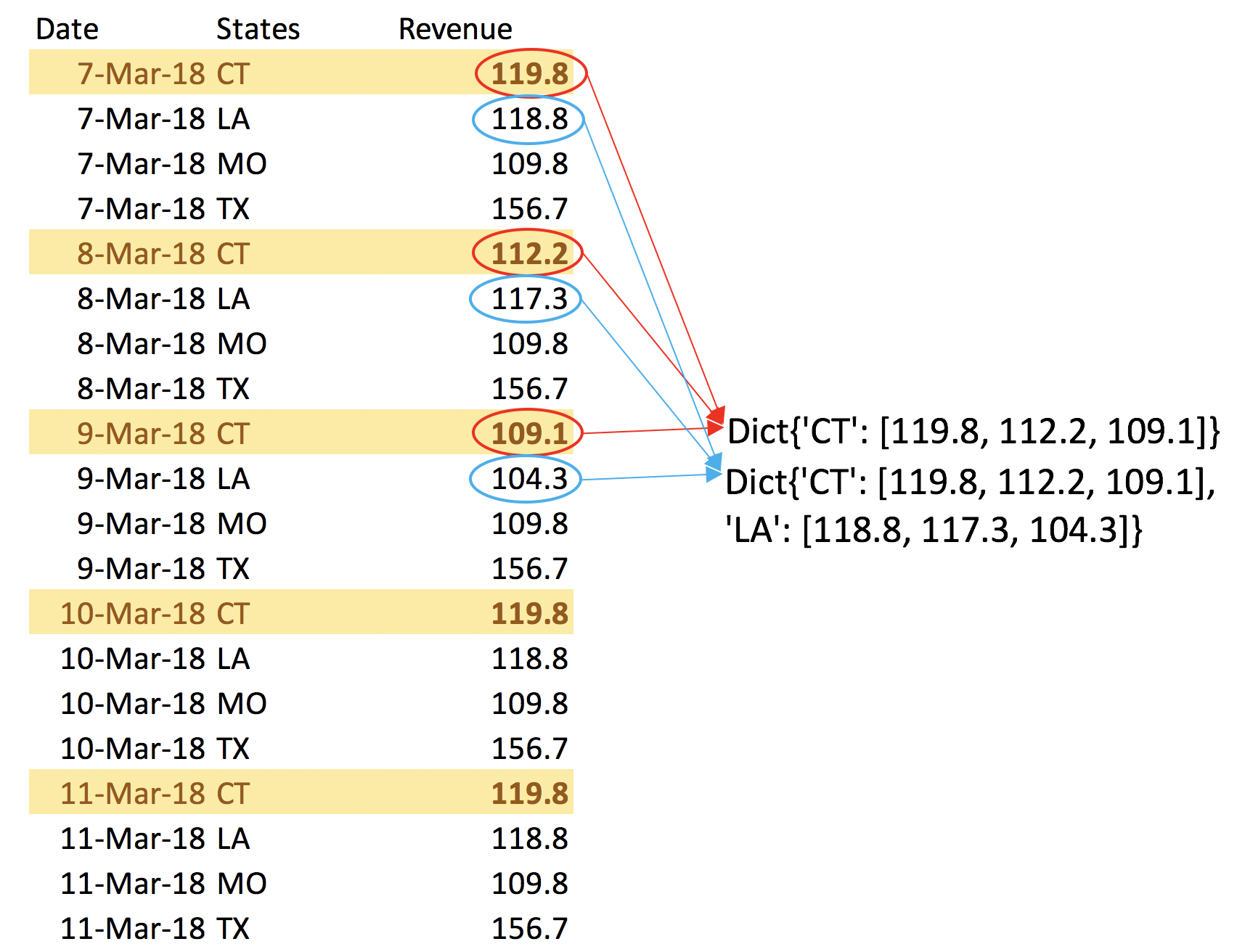
Now that we have the comprehensive array, with neat, tidy, and normal formatting, we can create an n-period moving average for each row. This will allow us to maintain daily granularity while simultaneously representing extended timeframes with each frame of the animation. To create a moving average we need to keep track of the last n instances of data for each state. We can create a dictionary which will pair a state code with a list of n instances that updates for each row – dynamically adding in the most current value and removing the oldest from the list. Here's a simplified look at what the dictionary is doing.
It pulls the state-specific fields and appends them to a list (n in this example is 3) that is paired with each state. The moving average for that day will be the average of the 3 items in the list.
Here is the code to accomplish this in the larger context. Note: MA_PERIODS is the variable that determines the periods of the moving averages.
Dictionary = dict()
for code in all_codes.tolist():
Dictionary[code[0]] = []
mas = []
#iterate thru rows
for row in Comp_Array_with_0s:
state_of_this_row = row[states_index]
if not Dictionary.get(state_of_this_row): #if list is empty
idk = []
if state_of_this_row == 'States':
mas.append('Moving Average')
else:
idk.append(row[column_index])
Dictionary[state_of_this_row] = idk
mas.append(None)
elif len(Dictionary.get(state_of_this_row)) == MA_PERIODS:
idk = Dictionary.get(state_of_this_row)
# pop first val into trash
trashcan = idk.pop(0)
# append with current val
idk.append(row[column_index])
# send back to dict with current list
Dictionary[state_of_this_row] = idk
# cpt and append moving average
ma = st.mean(idk)
mas.append(ma)
else: #if list is less than ma_periods
idk = Dictionary.get(state_of_this_row)
idk.append(row[column_index])
Dictionary[state_of_this_row] = idk
mas.append(None)
mas = np.array(mas).reshape(-1,1)
print(mas.ndim)
print(Comp_Array_with_0s.ndim)
Array_w_mas = np.hstack((Comp_Array_with_0s, mas))
Array_w_mas = Array_w_mas[~pd.isnull(Array_w_mas).any(axis=1)]
np.savetxt('Array_w_mas.csv', Array_w_mas.astype(np.str), fmt='%s', delimiter=",")
Python
It is also prudent to reference each value against the popultion of the state, to account for scale and circulation. We can load in state populations to reference against the moving averages here:
population = readcsv('population.csv')
popdict = dict()
for row in population:
popdict[row[0]] = row[1]
headers = pd.read_csv('Array_w_mas.csv').columns
ma_index = list(headers).index('Moving Average')
new_ratio_column = ['Moving Average : Population']
for row in Array_w_mas:
if row[states_index] != 'States':
if popdict[row[states_index]] != 0:
new_ratio_column.append(row[ma_index] / popdict[row[states_index]])
else:
new_ratio_column.append(0)
new_ratio_column = np.array(new_ratio_column).reshape(-1,1)
Array_w_mas = np.hstack((Array_w_mas, new_ratio_column))
np.savetxt('Array_w_mas.csv', Array_w_mas.astype(np.str), fmt='%s', delimiter=",")
Python
Perfect. Now we have a comprehensive and normalized datatable with a column for moving averages, and a column comparing the moving averages to each state's population.
Now we can populate files in the directory we are working from to be referenced while making the frames of the animation – each day will get it's own file, and its own frame.
headers = pd.read_csv('Array_w_mas.csv').columns
files = []
for date in dates_lst:
indices = np.where((Array_w_mas[:, 0] == date))
datedList = Array_w_mas[indices]
headers = np.array(headers)
if datedList.size != 0:
active_codes = datedList[:, states_index]
difference = np.setdiff1d(all_codes, active_codes)
array_with_correct_dimensions = np.full((difference.size, 9), .00001, dtype=np.float32).astype(str)
for i in range(0, difference.size-1):
array_with_correct_dimensions[i,1] = difference[i]
for i in range(0, difference.size):
array_with_correct_dimensions[i, 0] = datedList[0, 0]
array_with_correct_dimensions[:, 1] = difference # this might not work ##Edit: It worked
datedList = np.vstack((datedList, array_with_correct_dimensions))
datedList = np.vstack( (headers, datedList) )
filename = str(date) + ".csv"
filename = filename.replace(",","")
files.append(filename)
np.savetxt(filename, datedList.astype(np.str), fmt='%s', delimiter=",")
Python
Now all of the information is perfectly formatted to create the choropleths. We can prompt the user for details about the chart specs, and use their answers as variables in the code.
print("AVAILABLE DATA:",headers.values)
values = input("Enter the measure to be charted choroplethically: ")
if values == "":
values = 'Units'
color = input("Select colorscheme: (blue, red, darkred, bluered, tritonal, cuartonal): ")
if color == "":
color = 'red'
MA_PERIODS = input("Enter num periods for which to compute moving averages: ")
if MA_PERIODS == "":
MA_PERIODS = 14
else:
MA_PERIODS = int(MA_PERIODS)
daily_scale = input("Daily scale? (y/n): ")
chart_type = input("Enter chart type (ma or ma po): ")
if chart_type == "":
chart_type = 'ma po'
while chart_type != 'ma' and chart_type != 'ma po':
chart_type = input("Enter chart type (ma or ma po): ")
Python
Note: The 'ma' variable refers to plotting the moving averages, and the 'mapo' variable refers to plotting the ratio of moving average to state population.
These choropleths use a package for python called plotly, which is a very powerful tool for making data visualizations.
Here's the code for plotting the choropleths, based on the choices entered by the user. The code iterates through and makes one choropleth for each day, and outputs a jpg in the specified file directory.
ma_index = list(headers).index('Moving Average') ma_pop_index = list(headers).index('Moving Average : Population') ################################################################################################################### # ############################################################################################################### # # Choice One # # ############################################################################################################### # ################################################################################################################### if chart_type == 'ma': legend_max = max(Array_w_mas[1:,ma_index]) legend_min = min(Array_w_mas[1:,ma_index]) ma_values = 'Moving Average' import os import plotly.io as pio import plotly.plotly as py import plotly.graph_objs as go import pandas as pd imagefile_lst = [] # legend_min = 0 # legend_max = 5906 for filename in files: df = pd.read_csv(filename) for col in df.columns: df[col] = df[col].astype(str) ################################################################################################################# # Pick a color ################################################################################################################# if color == 'tritonal': scl = [ [0.0, 'rgb(255, 250, 204)'], [0.5, 'rgb(71, 162, 166)'], [1.0, 'rgb(1,25,147)'] ] elif color == 'blue': scl = [ [0.0, 'rgb(234,244,252)'], [1.0, 'rgb(32,80,124)'] ] elif color == 'bluered': scl = [ [0.0, 'rgb(242,240,247)'], [0.2, 'rgb(218,218,235)'], [0.4, 'rgb(188,189,220)'], [0.6, 'rgb(158,154,200)'], [0.8, 'rgb(117,107,177)'], [1.0, 'rgb(84,39,143)'] ] elif color == 'red': scl = [ [0.0, 'rgb(245, 255, 254)'], [1.0, 'rgb(110,0,107)']] elif color == 'darkred': scl = [ [0.0, 'rgb(246, 252, 253)'], [0.6, 'rgb(110, 0, 107)'], [1.0, 'rgb(65, 25, 75)'] ] elif color == 'darkerred': scl = [ [0.0, 'rgb(232, 243, 242)'], [0.6, 'rgb(110, 0, 107)'], [1.0, 'rgb(65, 25, 75)'] ] elif color == 'cuartonal': scl = [ [0.0, 'rgb(255, 250, 204)'], [0.2, 'rgb(71, 162, 166)'], [0.65, 'rgb(1,25,147)'], [1.0, 'rgb(52, 13, 84)']] ################################################################################################################# df['text'] = df['States'] + '<br>' + \ ma_values+' ' + df[ma_values] if not daily_scale == 'y': data = [go.Choropleth( colorscale = scl, autocolorscale = False, zmin = legend_min, zmax = legend_max, zauto = False, locations = df['States'], z = df[ma_values].astype(float), locationmode = 'USA-states', text = df['text'], marker = go.choropleth.Marker( line = go.choropleth.marker.Line( color = 'rgb(255,255,255)', width = 2 )), colorbar = go.choropleth.ColorBar( title = "Measure") )] else: data = [go.Choropleth( colorscale=scl, autocolorscale=False, # zmin=legend_min, # zmax=legend_max, # zauto=False, locations=df['States'], z=df[ma_values].astype(float), locationmode='USA-states', text=df['text'], marker=go.choropleth.Marker( line=go.choropleth.marker.Line( color='rgb(255,255,255)', width=2 )), colorbar=go.choropleth.ColorBar( title="Measure") )] layout = go.Layout( title = go.layout.Title( text = values+' Breakdown by State<br>'+str(MA_PERIODS)+' Period Moving Average<br>'+filename[:-9]+","+filename[-9:-4] ), geo = go.layout.Geo( scope = 'usa', projection = go.layout.geo.Projection(type = 'albers usa'), showlakes = True, lakecolor = 'rgb(255, 255, 255)'), # showland = True, # landcolor = 'rgb(234, 244, 252)', # showcoastlines = True, # coastlinecolor = 'rgb(0,0,0)', # coastlinewidth = 1), ) fig = go.Figure(data = data, layout = layout) if not os.path.exists('images'): os.mkdir('images') pio.write_image(fig, 'images/'+filename[:-4].replace(" ","_")+'.jpg', width=1920, height=1080, scale=2) imagefile_lst.append(filename[:-4].replace(" ","_")+'.jpg') outfile = open("imagefile_names.txt", "w") outfile.write("convert -delay 3 loop 0 ") for filename in imagefile_lst: outfile.write(filename) outfile.write(" ") outfile.close() ################################################################################################################### # ############################################################################################################### # # Choice Two # # ############################################################################################################### # ################################################################################################################### elif chart_type == 'ma po': legend_max = max(Array_w_mas[1:, ma_pop_index]) legend_min = min(Array_w_mas[1:, ma_pop_index]) ma_values = 'Moving Average : Population' import os import plotly.io as pio import plotly.plotly as py import plotly.graph_objs as go import pandas as pd imagefile_lst = [] # legend_min = 0 # legend_max = 5906 for filename in files: df = pd.read_csv(filename) for col in df.columns: df[col] = df[col].astype(str) ################################################################################################################# # Pick a color ################################################################################################################# if color == 'tritonal': scl = [ [0.0, 'rgb(255, 250, 204)'], [0.5, 'rgb(71, 162, 166)'], [1.0, 'rgb(1,25,147)'] ] elif color == 'blue': scl = [ [0.0, 'rgb(234,244,252)'], [1.0, 'rgb(32,80,124)'] ] elif color == 'bluered': scl = [ [0.0, 'rgb(242,240,247)'], [0.2, 'rgb(218,218,235)'], [0.4, 'rgb(188,189,220)'], [0.6, 'rgb(158,154,200)'], [0.8, 'rgb(117,107,177)'], [1.0, 'rgb(84,39,143)'] ] elif color == 'red': scl = [ [0.0, 'rgb(245, 255, 254)'], [1.0, 'rgb(110,0,107)']] elif color == 'darkred': scl = [ [0.0, 'rgb(246, 252, 253)'], [0.6, 'rgb(110, 0, 107)'], [1.0, 'rgb(65, 25, 75)'] ] elif color == 'darkerred': scl = [ [0.0, 'rgb(232, 243, 242)'], [0.6, 'rgb(110, 0, 107)'], [1.0, 'rgb(65, 25, 75)'] ] elif color == 'cuartonal': scl = [ [0.0, 'rgb(255, 250, 204)'], [0.2, 'rgb(71, 162, 166)'], [0.65, 'rgb(1,25,147)'], [1.0, 'rgb(52, 13, 84)']] ################################################################################################################# df['text'] = df['States'] + '<br>' + \ ma_values + ' ' + df[ma_values] if not daily_scale == 'y': data = [go.Choropleth( colorscale=scl, autocolorscale=False, zmin=legend_min, zmax=legend_max, zauto=False, # tickformat='μ', locations=df['States'], z=df[ma_values].astype(float), locationmode='USA-states', text=df['text'], marker=go.choropleth.Marker( line=go.choropleth.marker.Line( color='rgb(255,255,255)', width=2 )), colorbar=go.choropleth.ColorBar( title="Measure : Population") # tickformat='μ',) )] else: data = [go.Choropleth( colorscale=scl, autocolorscale=False, # zmin=legend_min, # zmax=legend_max, # zauto=False, # tickformat='μ', locations=df['States'], z=df[ma_values].astype(float), locationmode='USA-states', text=df['text'], marker=go.choropleth.Marker( line=go.choropleth.marker.Line( color='rgb(255,255,255)', width=2 )), colorbar=go.choropleth.ColorBar( title="Measure : Population", # tickformat= formatPrefix(",.0", 1e-6) ) )] layout = go.Layout( title=go.layout.Title( text=values + ' Breakdown by State<br>' + str(MA_PERIODS) + ' Period Moving Average<br>' + filename[ :-9] + "," + filename[ -9:-4] ), geo=go.layout.Geo( scope='usa', projection=go.layout.geo.Projection(type='albers usa'), showlakes=True, lakecolor='rgb(255, 255, 255)'), # showland = True, # landcolor = 'rgb(234, 244, 252)', # showcoastlines = True, # coastlinecolor = 'rgb(0,0,0)', # coastlinewidth = 1), ) fig = go.Figure(data=data, layout=layout) if not os.path.exists('images'): os.mkdir('images') pio.write_image(fig, 'images/' + filename[:-4].replace(" ", "_") + '.jpg', width=1920, height=1080, scale=2) imagefile_lst.append(filename[:-4].replace(" ", "_") + '.jpg') outfile = open("imagefile_names.txt", "w") outfile.write("convert -delay 3 loop 0 ") for filename in imagefile_lst: outfile.write(filename) outfile.write(" ") outfile.close()
Python
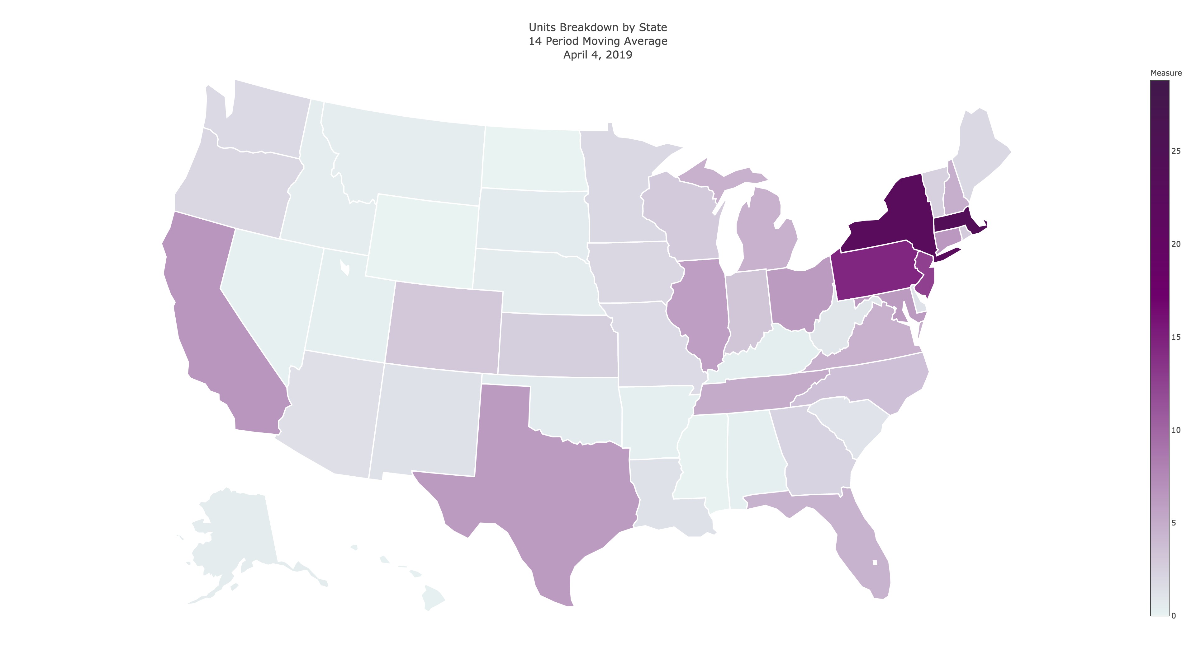
Perfect. Now we have a different 4k jpg for each day, that look similar to this (depending on the color, scale, and type specs):
The next step is to compile the .jpg files into an animated format, either .gif or .mp4. I originally went with .gif, but .gif formatting makes the file sizes enormous so .mp4 is easier to work with. There are two wonderful command line tools called ImageMagick and Ffmpeg that we can use to compile the files easily. All you have to do (after installing the packages) is navigate to the directory with your image files, and enter some code:
convert -delay 60 -loop 0 infile_1.jpg infile_2.jpg infile_3.jpg outfile.mp4
Plain Text
Since we have around 500 4k resolution files, this will take an outrageous amount of temporary work space – almost two hundred gigabytes. So to have this run, you either must have plenty of free space on your drive, or scale down the resolution of the files. In an earlier code snippet, I snuck in a line to save the exact code we need to enter into terminal to a .txt file (in lue of entering in 500 filenames maunally). We can copy and paste that file into the commandline, enter the name of our output file, and then let it run.
convert -delay 3 loop 0 March_21_2018.jpg March_22_2018.jpg March_23_2018.jpg March_24_2018.jpg March_25_2018.jpg March_26_2018.jpg March_27_2018.jpg March_28_2018.jpg March_29_2018.jpg March_30_2018.jpg March_31_2018.jpg April_1_2018.jpg April_2_2018.jpg April_3_2018.jpg April_4_2018.jpg April_5_2018.jpg April_6_2018.jpg April_7_2018.jpg April_8_2018.jpg April_9_2018.jpg April_10_2018.jpg April_11_2018.jpg April_12_2018.jpg April_13_2018.jpg April_14_2018.jpg April_15_2018.jpg April_16_2018.jpg April_17_2018.jpg April_18_2018.jpg April_19_2018.jpg April_20_2018.jpg April_21_2018.jpg April_22_2018.jpg April_23_2018.jpg April_24_2018.jpg April_25_2018.jpg April_26_2018.jpg April_27_2018.jpg April_28_2018.jpg April_29_2018.jpg April_30_2018.jpg May_1_2018.jpg May_2_2018.jpg May_3_2018.jpg May_4_2018.jpg May_5_2018.jpg May_6_2018.jpg May_7_2018.jpg May_8_2018.jpg May_9_2018.jpg May_10_2018.jpg May_11_2018.jpg May_12_2018.jpg May_13_2018.jpg May_14_2018.jpg May_15_2018.jpg May_16_2018.jpg May_17_2018.jpg May_18_2018.jpg May_19_2018.jpg May_20_2018.jpg May_21_2018.jpg May_22_2018.jpg May_23_2018.jpg May_24_2018.jpg May_25_2018.jpg May_26_2018.jpg May_27_2018.jpg May_28_2018.jpg May_29_2018.jpg May_30_2018.jpg May_31_2018.jpg June_1_2018.jpg June_2_2018.jpg June_3_2018.jpg June_4_2018.jpg June_5_2018.jpg June_6_2018.jpg June_7_2018.jpg June_8_2018.jpg June_9_2018.jpg June_10_2018.jpg June_11_2018.jpg June_12_2018.jpg June_13_2018.jpg June_14_2018.jpg June_15_2018.jpg June_16_2018.jpg June_17_2018.jpg June_18_2018.jpg June_19_2018.jpg June_20_2018.jpg June_21_2018.jpg June_22_2018.jpg June_23_2018.jpg June_24_2018.jpg June_25_2018.jpg June_26_2018.jpg June_27_2018.jpg June_28_2018.jpg June_29_2018.jpg June_30_2018.jpg July_1_2018.jpg July_2_2018.jpg July_3_2018.jpg July_4_2018.jpg July_5_2018.jpg July_6_2018.jpg July_7_2018.jpg July_8_2018.jpg July_9_2018.jpg July_10_2018.jpg July_11_2018.jpg July_12_2018.jpg July_13_2018.jpg July_14_2018.jpg July_15_2018.jpg July_16_2018.jpg July_17_2018.jpg July_18_2018.jpg July_19_2018.jpg July_20_2018.jpg July_21_2018.jpg July_22_2018.jpg July_23_2018.jpg July_24_2018.jpg July_25_2018.jpg July_26_2018.jpg July_27_2018.jpg July_28_2018.jpg July_29_2018.jpg July_30_2018.jpg July_31_2018.jpg August_1_2018.jpg August_2_2018.jpg August_3_2018.jpg August_4_2018.jpg August_5_2018.jpg August_6_2018.jpg August_7_2018.jpg August_8_2018.jpg August_9_2018.jpg August_10_2018.jpg August_11_2018.jpg August_12_2018.jpg August_13_2018.jpg August_14_2018.jpg August_15_2018.jpg August_16_2018.jpg August_17_2018.jpg August_18_2018.jpg August_19_2018.jpg August_20_2018.jpg August_21_2018.jpg August_22_2018.jpg August_23_2018.jpg August_24_2018.jpg August_25_2018.jpg August_26_2018.jpg August_27_2018.jpg August_28_2018.jpg August_29_2018.jpg August_30_2018.jpg August_31_2018.jpg September_1_2018.jpg September_2_2018.jpg September_3_2018.jpg September_4_2018.jpg September_5_2018.jpg September_6_2018.jpg September_7_2018.jpg September_8_2018.jpg September_9_2018.jpg September_10_2018.jpg September_11_2018.jpg September_12_2018.jpg September_13_2018.jpg September_14_2018.jpg September_15_2018.jpg September_16_2018.jpg September_17_2018.jpg September_18_2018.jpg September_19_2018.jpg September_20_2018.jpg September_21_2018.jpg September_22_2018.jpg September_23_2018.jpg September_24_2018.jpg September_25_2018.jpg September_26_2018.jpg September_27_2018.jpg September_28_2018.jpg September_29_2018.jpg September_30_2018.jpg October_1_2018.jpg October_2_2018.jpg October_3_2018.jpg October_4_2018.jpg October_5_2018.jpg October_6_2018.jpg October_7_2018.jpg October_8_2018.jpg October_9_2018.jpg October_10_2018.jpg October_11_2018.jpg October_12_2018.jpg October_13_2018.jpg October_14_2018.jpg October_15_2018.jpg October_16_2018.jpg October_17_2018.jpg October_18_2018.jpg October_19_2018.jpg October_20_2018.jpg October_21_2018.jpg October_22_2018.jpg October_23_2018.jpg October_24_2018.jpg October_25_2018.jpg October_26_2018.jpg October_27_2018.jpg October_28_2018.jpg October_29_2018.jpg October_30_2018.jpg October_31_2018.jpg November_1_2018.jpg November_2_2018.jpg November_3_2018.jpg November_4_2018.jpg November_5_2018.jpg November_6_2018.jpg November_7_2018.jpg November_8_2018.jpg November_9_2018.jpg November_10_2018.jpg November_11_2018.jpg November_12_2018.jpg November_13_2018.jpg November_14_2018.jpg November_15_2018.jpg November_16_2018.jpg November_17_2018.jpg November_18_2018.jpg November_19_2018.jpg November_20_2018.jpg November_21_2018.jpg November_22_2018.jpg November_23_2018.jpg November_24_2018.jpg November_25_2018.jpg November_26_2018.jpg November_27_2018.jpg November_28_2018.jpg November_29_2018.jpg November_30_2018.jpg December_1_2018.jpg December_2_2018.jpg December_3_2018.jpg December_4_2018.jpg December_5_2018.jpg December_6_2018.jpg December_7_2018.jpg December_8_2018.jpg December_9_2018.jpg December_10_2018.jpg December_11_2018.jpg December_12_2018.jpg December_13_2018.jpg December_14_2018.jpg December_15_2018.jpg December_16_2018.jpg December_17_2018.jpg December_18_2018.jpg December_19_2018.jpg December_20_2018.jpg December_21_2018.jpg December_22_2018.jpg December_23_2018.jpg December_24_2018.jpg December_25_2018.jpg December_26_2018.jpg December_27_2018.jpg December_28_2018.jpg December_29_2018.jpg December_30_2018.jpg December_31_2018.jpg January_1_2019.jpg January_2_2019.jpg January_3_2019.jpg January_4_2019.jpg January_5_2019.jpg January_6_2019.jpg January_7_2019.jpg January_8_2019.jpg January_9_2019.jpg January_10_2019.jpg January_11_2019.jpg January_12_2019.jpg January_13_2019.jpg January_14_2019.jpg January_15_2019.jpg January_16_2019.jpg January_17_2019.jpg January_18_2019.jpg January_19_2019.jpg January_20_2019.jpg January_21_2019.jpg January_22_2019.jpg January_23_2019.jpg January_24_2019.jpg January_25_2019.jpg January_26_2019.jpg January_27_2019.jpg January_28_2019.jpg January_29_2019.jpg January_30_2019.jpg January_31_2019.jpg February_1_2019.jpg February_2_2019.jpg February_3_2019.jpg February_4_2019.jpg February_5_2019.jpg February_6_2019.jpg February_7_2019.jpg February_8_2019.jpg February_9_2019.jpg February_10_2019.jpg February_11_2019.jpg February_12_2019.jpg February_13_2019.jpg February_14_2019.jpg February_15_2019.jpg February_16_2019.jpg February_17_2019.jpg February_18_2019.jpg February_19_2019.jpg February_20_2019.jpg February_21_2019.jpg February_22_2019.jpg February_23_2019.jpg February_24_2019.jpg February_25_2019.jpg February_26_2019.jpg February_27_2019.jpg February_28_2019.jpg March_1_2019.jpg March_2_2019.jpg March_3_2019.jpg March_4_2019.jpg March_5_2019.jpg March_6_2019.jpg March_7_2019.jpg March_8_2019.jpg March_9_2019.jpg March_10_2019.jpg March_11_2019.jpg March_12_2019.jpg March_13_2019.jpg March_14_2019.jpg March_15_2019.jpg March_16_2019.jpg March_17_2019.jpg March_18_2019.jpg March_19_2019.jpg March_20_2019.jpg March_21_2019.jpg March_22_2019.jpg March_23_2019.jpg March_24_2019.jpg March_25_2019.jpg March_26_2019.jpg March_27_2019.jpg March_28_2019.jpg March_29_2019.jpg March_30_2019.jpg March_31_2019.jpg April_1_2019.jpg April_2_2019.jpg April_3_2019.jpg April_4_2019.jpg April_5_2019.jpg April_6_2019.jpg April_7_2019.jpg April_8_2019.jpg April_9_2019.jpg April_10_2019.jpg April_11_2019.jpg April_12_2019.jpg April_13_2019.jpg April_14_2019.jpg April_15_2019.jpg April_16_2019.jpg April_17_2019.jpg April_18_2019.jpg April_19_2019.jpg April_20_2019.jpg April_21_2019.jpg April_22_2019.jpg April_23_2019.jpg April_24_2019.jpg April_25_2019.jpg April_26_2019.jpg April_27_2019.jpg April_28_2019.jpg April_29_2019.jpg April_30_2019.jpg May_1_2019.jpg May_2_2019.jpg May_3_2019.jpg May_4_2019.jpg May_5_2019.jpg May_6_2019.jpg May_7_2019.jpg May_8_2019.jpg May_9_2019.jpg May_10_2019.jpg May_11_2019.jpg May_12_2019.jpg May_13_2019.jpg May_14_2019.jpg May_15_2019.jpg May_16_2019.jpg May_17_2019.jpg May_18_2019.jpg May_19_2019.jpg May_20_2019.jpg May_21_2019.jpg May_22_2019.jpg May_23_2019.jpg May_24_2019.jpg May_25_2019.jpg May_26_2019.jpg May_27_2019.jpg May_28_2019.jpg May_29_2019.jpg May_30_2019.jpg May_31_2019.jpg June_1_2019.jpg June_2_2019.jpg June_3_2019.jpg June_4_2019.jpg June_5_2019.jpg June_6_2019.jpg June_7_2019.jpg June_8_2019.jpg June_9_2019.jpg June_10_2019.jpg June_11_2019.jpg June_12_2019.jpg June_13_2019.jpg June_14_2019.jpg June_15_2019.jpg June_16_2019.jpg June_17_2019.jpg June_18_2019.jpg June_19_2019.jpg June_20_2019.jpg June_21_2019.jpg June_22_2019.jpg June_23_2019.jpg June_24_2019.jpg June_25_2019.jpg June_26_2019.jpg June_27_2019.jpg June_28_2019.jpg June_29_2019.jpg June_30_2019.jpg basavi.mp4
Plain Text
And we're done! We now have a beautiful and meaningful animated choropleth tailored to our business analysis.
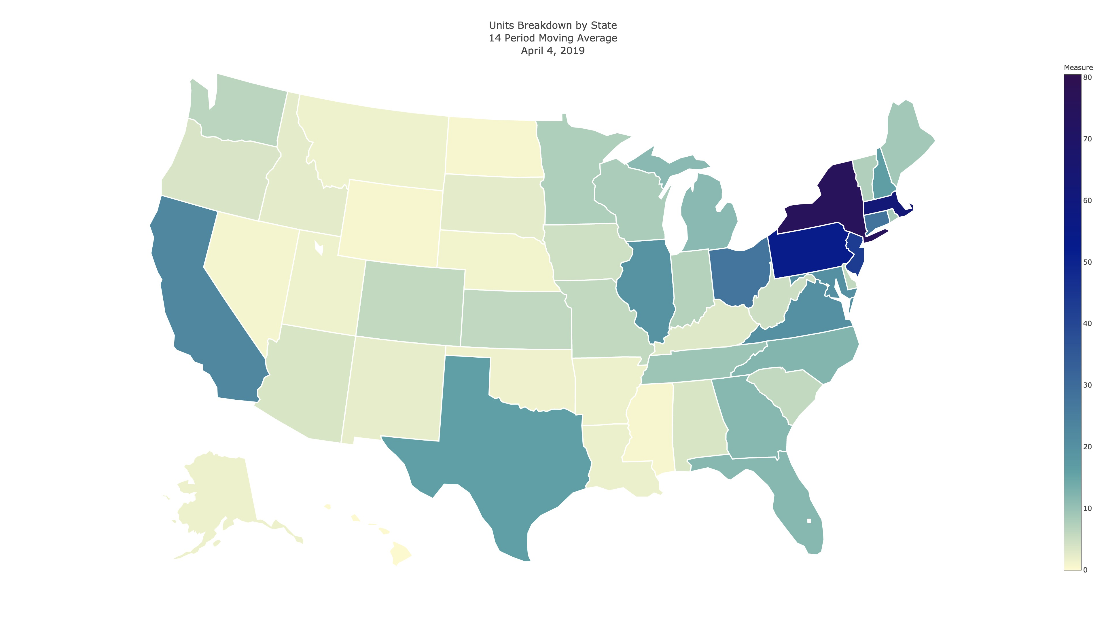
And here is a look at the optional reference against state population, with a dynamic scale.
We can compile these choropleths together to make comparisions between product segments using any video editor that can handle 4 channels. Here's a look at the final products! (I had to scale them down from 8k to 4k because 8k is rediculous).
Again, this is an analysis of the X line; all X are represented in the top left, A in the top right, B bottom left, and C bottom right.